Joining the Renewable Heating Hub forums is completely free and only takes a minute. By registering you’ll be able to ask questions, join discussions, follow topics you’re interested in, bookmark useful threads and receive notifications when someone replies. Non-registered members also do not have access to our AI features. When choosing your username, please note that it cannot be changed later, so we recommend avoiding brand or product names. Before registering, please take a moment to read the Forum Rules & Terms of Use so we can keep the community helpful, respectful and informative for everyone. Thanks for joining!
@sheriff-fatman — thanks, that is a bit more affordable. I need to work out how to collect the data using python, which is presumably what HA does behind the scenes.
Midea 14kW (for now...) ASHP heating both building and DHW
At long last! I have now collected and plotted the data for two consecutive springs, 2025 and 2026, using an overnight setback in 2025, but no setback in 2026, the idea being to compare the two, to see whether using a six hour overnight setback (2100 to 0300) uses less energy than running with no setback. Common sense says it does, physics says it doesn't, what does the evidence show?
First a note or two on the data set and methodology. The data comes from one property, mine (so strictly speaking this is a n=1 study, it may not apply to other properties), collected over modbus. The data is raw data reported by the Midea sensors, the OAT (outside air temperature) being in fact the AIT (air intake temperature, because the sensor is located in the heat pump air intake. It is certainly related to the true OAT, and seems to be a good enough proxy for the true OAT. The energy in (consumed) if kWh is calculated from the amps and volts supplied to the unit over time, adjusted by a correction factor (1.18) which corrects for the fact the Midea data slightly under-estimate actual use, as measured by an independent kWh meter that only supplies the heat pump. This deficit is likely to arise because the Midea monitoring does not include ancillaries eg the circulating pump. All the data are collected at one minute intervals.
We thus have two data sets, one from spring 2025, with setback running, and one from spring 2026, with no setback running. The data covers March and April for both years, as this is the period when nothing else changed, apart from of course the daily mean OATs, but we deal with that by collecting a whole series of data, which will include a range of daily mean OATS with considerable overlap. We can then plot the daily kWh use against the daily mean OAT for that day, and compare the two data sets. Note that the 'days' run noon to noon, so that each setback when it occurred all happens within the same 'day'. The value for example for the 1st April is the mean OAT and cumulative energy use for the 24 hour period up to noon on 1st April. The shift was done by using an extra column in the data set which shifted the date to achieve this result.
The analysis and plots were done in R, a statistical package well suited to this sort of thing. It is versatile, and produces aesthetically pleasing plots, at least to my eye, using ggplot2 and related libraries.
First an overview of the two periods in question, plotted from the minute by minute data:
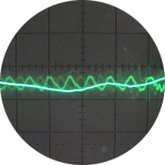
They appear to be broadly similar, apart from the saw tooth pattern in the IAT (indoor air temperature) and the zero energy use between 2100 and 0300 caused by the setbacks in spring 2025. Note that the data from the very end of April each year is not included in the analysis, as the heat pump was off then. The basic stats for each period are similar, but not the same:
The mean OATs over the two periods are in effect the same, though 2025 showed a slightly greater range and standard deviation (SD).
And now for the daily mean OAT vs daily energy use plots. Here they are, first without a second order polynomial (quadratic, y = ax + bx^2 + c) regression line fitted, to get a view without being influenced visually by the lines, and then with the regression lines, with 95% confidence intervals — or bands, depending on source, the R documentation calls them confidence intervals, the ggplot2 documentation calls them confidence bands, which I will henceforth use:
In the upper plot, I see what looks like some difference. For a given mean daily OAT (in effect the 'matched pairs' (and triplets quadruplets etc) I have previously mentioned), the orange points (with setback) tend to be lower than the blue dots (no setback). In the lower plot this becomes more apparent, particularly at lower daily mean OATs. In general terms, when the confidence bands do not overlap, we can say that the two samples do not come from the same one homogeneous population, or in other words, they are very likely genuinely different.
On the basis of this data and its analysis, it does appear that setback running does save money, but only at moderate to low OATS, below about 10 or 11°C daily mean OAT. Above that daily mean OAT, the separation disappears, and I have no idea why. This needs further consideration and explanation. The analysis is also limited by the fact that being spring, there are no days with a very low mean OAT, and only a few with lowish OATs. We might speculate that the divergence will increase at lower OATS, but should not do so because we have no data.
Technical statistical note: I am not entirely comfortable with the confidence bands, they look too tight to me particularly at lower daily mean OATs. My understanding is they are the confidence bands for the line; in simple terms, there is a 95% chance the grey area includes the true (population) line, and the general, by which I mean common, though not necessarily correct, interpretation is that where the bands do not overlap, there is a strong indication the samples are different, ie come from different populations, in this case on the one hand the setback population, on the other hand the no setback population. Any comments on this part of the analysis are particularly welcome.
If my analysis is correct, the savings are not great, but neither are they trivial. Eyeballing the lower plot, they are about 10% of the daily use. Thus at around 20kWh per day, the saving is about 2kWh, at around 50kWh per day the saving is around 5kWh.
Any and all comments very welcome.
Midea 14kW (for now...) ASHP heating both building and DHW
Are you by any chance able also to work out the average IAT with setback and non setback in a way that is strictly comparable. That will help us understand if there is anything that is not readily explicable from the thermodynamics going on.
On the basis of this data and its analysis, it does appear that setback running does save money, but only at moderate to low OATS, below about 10 or 11°C daily mean OAT.
The most obvious explanation would be that, when OAT is elevated, the house doesn't cool much during setback, thus the reduction in energy loss from the house is insufficient to rise above the noise.
If my analysis is correct, the savings are not great, but neither are they trivial. Eyeballing the lower plot, they are about 10% of the daily use. Thus at around 20kWh per day, the saving is about 2kWh, at around 50kWh per day the saving is around 5kWh
Can you just explain 10% as it looks like it varies with OAT and thats what you say above. Is it some sort of weighted average.
, the idea being to compare the two, to see whether using a six hour overnight setback (2100 to 0300) uses less energy than running with no setback. Common sense says it does, physics says it doesn't, what does the evidence show?
As a physicist I dispute that physics says it doesn't! What physics says is that the saving is limited (ie nothing like the 25% that some - not you - have claimed) and may be outweighed by loss in efficiency. Modelling based on the physics suggests that sometimes it is outweighed and sometimes it isnt. Thats very different!
This post was modified 5 months ago 3 times by JamesPa
4kW peak of solar PV since 2011; EV and a 1930s house which has been partially renovated to improve its efficiency. 7kW Vaillant heat pump.
@cathoderay, this is excellent work... one of the more detailed and thoughtful pieces of homeowner-led analysis we’ve ever had on the forums!
You’ve gone well beyond opinion here and actually built a meaningful comparison around real operating data, weather normalisation and energy use, which makes this particularly valuable. While it’s obviously specific to your property and system, your findings do seem to suggest that modest overnight setback may offer savings under certain conditions, which is an interesting counterpoint to the usual blanket "never setback a heat pump" advice. Really impressive effort!
I 100% agree its absolutely excellent work, but before we attempt to draw general conclusions (which @cathoderay has, very sensibly, carefully avoided doing) I would personally advocate getting a bit more understanding out of the data. For example:
If what is being seen itcanbe explained by average IAT differences, then what it tells us is that concerns about COP variations wiping out savings due to loss reduction are experimentally (in this case) not validated. This is a fairly satisfactory situation and likely more generally applicable.
If itcantbe explained by average IAT differences then it says we don't understand what is going on, which means that we cant apply it to any other situation because we have no idea what the mechanism is. This is an unsatisfactory (and unhelpful) situation and means that we cant really draw general conclusions until we understand more.
Good science rests on good data (which I believe@cathoderayhas) andgood interpretation/understanding, the latter particularly if we want to apply it to any other case. I dont think we yet have the latter, albeit I think we have the data that would mean we could have the latter.
I have asked a couple of questions above which should help clarify whether we can collectively explain what is going on whether there is something mysterious happening that we dont yet understand.
This post was modified 5 months ago 3 times by JamesPa
4kW peak of solar PV since 2011; EV and a 1930s house which has been partially renovated to improve its efficiency. 7kW Vaillant heat pump.
What @cathoderay has produced is a valuable dataset and a thoughtful piece of initial analysis. For me, this potentially moves the conversation away from assumptions and towards measured evidence.
That said, I completely agree that caution is important before anyone starts drawing broader conclusions.
At the moment, what we appear to have is strong evidence that, in this particular property and under these operating conditions, setback may have delivered measurable savings during certain temperature ranges. That’s pretty interesting. But understanding the underlying mechanism is important if we want this to become more broadly useful.
If the observed savings are primarily explained by lower average indoor air temperatures reducing overnight heat loss (with recovery costs not severe enough to offset those gains) then that gives us a fairly coherent and potentially transferable explanation. In that case, it would suggest that (at least in some systems) concerns about COP penalties entirely negating setback savings may be overstated.
If, however, the observed differences cannot be adequately explained by IAT changes, then we may well be looking at more complex system-specific behaviours that we do not yet fully understand in the context of the data. That doesn’t invalidate the findings, but it would mean we need to be much more cautious about applying them elsewhere until the mechanism is clearer.
So I think your point is correct... good data is only part of the equation. Good interpretation is what ultimately determines whether findings can move beyond an interesting case study and become genuinely useful guidance.
Are you by any chance able also to work out the average IAT with setback and non setback in a way that is strictly comparable. That will help us understand if there is anything that is not readily explicable from the thermodynamics going on.
I can certainly work out the average IATs over various intervals (hourly, 24 hourly and entire series). I expect the setback period ones will be slightly lower, as it is the common sense basis for thinking less energy is used (along with the even more basic if it's off for six hours, it ain't using energy for six hours). This is what I get: the mean IAT for the entire setback period was 19.26°C, for the no setback period it was 20.57°C, more than a degree higher. If the old wives' tale that a one degree difference in room temp equates to a 10% difference in energy consumption, then we might well expect the setback period to use less energy overall, by about ten percent (which is what I roughly observed, see also comment below on this).
The most obvious explanation [for the loss of visible separation at higher OATs] would be that, when OAT is elevated, the house doesn't cool much during setback, thus the reduction in energy loss from the house is insufficient to rise above the noise.
I think that is plausible. It is also notable that the scatter at higher OAT's appears to be greater, but that may be just because there are more readings in those conditions.
Can you just explain 10% as it looks like it varies with OAT and thats what you say above. Is it some sort of weighted average.
The absolute difference does vary with OAT, but the percentage stays much the same below 10°C OAT. At that OAT, the setback use is around 20kWh per day, the non-setback use is around 22.5kWh per day, a 10% difference give or take. At 5°C OAT, the respective use is 45 and 50kWh again 10% give or take. Here's the chart again showing what I mean:
As a physicist I dispute that physics says it doesn't!
Father James, forgive me, for I know I have sinned. But you know me, I can be inclined to summarise positions (not just yours) over-succinctly. I do know very well that you accept there may be modest savings in particular circumstances.
If what is being seen itcanbe explained by average IAT differences, then what it tells us is that concerns about COP variations wiping out savings due to loss reduction are experimentally (in this case) not validated. This is a fairly satisfactory situation and likely more generally applicable.
If itcantbe explained by average IAT differences then it says we don't understand what is going on, which means that we cant apply it to any other situation because we have no idea what the mechanism is. This is an unsatisfactory (and unhelpful) situation and means that we cant really draw general conclusions until we understand more.
As noted above, I think the mean IAT difference may be key to understanding what is going on. It is also important to note that on most mornings the IAT recovery after a setback was by breakfast time more than adequate, it not complete, though following very cold nights it did struggle. A couple of cold nights with setbacks:
And a couple with more moderate overnight temperatures:
So I think your [@jamespa's] point is correct... good data is only part of the equation. Good interpretation is what ultimately determines whether findings can move beyond an interesting case study and become genuinely useful guidance.
Absolutely. Raw data can be bent, intentionally or unintentionally, all too easily. It is also the case that just because you can do a statistical analysis, because they are ridiculously easy to do these days, it doesn't mean you should, which is indirectly what i was getting at in my 'Technical statistical note' — yes, I can put the confidence bands on the plots, but what do they really mean/tell us?
The other essential part of the overall research equation is to make sure you ask the right question. Better to have a generally correct answer to the right question, than an exquisitely perfect right answer to the wrong question.
Midea 14kW (for now...) ASHP heating both building and DHW
Are you by any chance able also to work out the average IAT with setback and non setback in a way that is strictly comparable. That will help us understand if there is anything that is not readily explicable from the thermodynamics going on.
I can certainly work out the average IATs over various intervals (hourly, 24 hourly and entire series). I expect the setback period ones will be slightly lower, as it is the common sense basis for thinking less energy is used (along with the even more basic if it's off for six hours, it ain't using energy for six hours). This is what I get: the mean IAT for the entire setback period was 19.26°C, for the no setback period it was 20.57°C, more than a degree higher. If the old wives' tale that a one degree difference in room temp equates to a 10% difference in energy consumption, then we might well expect the setback period to use less energy overall, by about ten percent (which is what I roughly observed, see also comment below on this)
Thanks
I have been trying to think out what we want. Its essentially to compare the saving in energy with the difference in average IAT, both as a function of OAT (thus expressly dealing with the 'struggle to recover'). So thats a third and fourth line on your/a separate chart (average IAT corresponding to each point in the two groups - so I suppose in each case over 24hrs if thats what each point represents - with the trendlines).
Then we want the differences in each case, I would suggest as a % in the case of energy and just in degC in the case of IAT. Probably just subtracting the trendlines is sufficient and then, in the case of energy only, dividing by the trendline energy in the non setback case. Is that tolerably easy?
I think 10% per degree is based on a calculation like average outdoor temp during the heating season is ~7C and average OAT at which the house will 'heat itself' is ~17C so difference is 10C thus 1C=10%. It has at least some basis in handwaving physics beyond an old wive's tale.
I think it might also be interesting to plot the average 'daytime' temperature (or daytime deficit) in both cases, where 'daytime' is defined as the period between when you 'wanted' the room temp to return to its set value and when the setback ends. This tells us the 'comfort penalty' (if any) for setback in your case. Well something like that anyway as a measure of the practical effect of 'struggling to recover'. This is a secondary matter which wont help us understand the physics but might be important in interpreting the effect on the user and also what will happen in any system with an element of 'auto adjust' built in.
This post was modified 5 months ago 3 times by JamesPa
4kW peak of solar PV since 2011; EV and a 1930s house which has been partially renovated to improve its efficiency. 7kW Vaillant heat pump.
I have been trying to think out what we want. Its essentially to compare the saving in energy with the difference in average IAT, both as a function of OAT (thus expressly dealing with the 'struggle to recover'). So thats a third and fourth line on your/a separate chart (average IAT corresponding to each point in the two groups - so I suppose in each case over 24hrs if thats what each point represents - with the trendlines).
Then we want the differences in each case, I would suggest as a % in the case of energy and just in degC in the case of IAT. Probably just subtracting the trendlines is sufficient and then, in the case of energy only, dividing by the trendline energy in the non setback case. Is that tolerably easy?
This could quickly become complex! The data points are real observed values, each one representing a 24 hour noon to noon period, with the 24 hour energy use plotted against the mean OAT for the same 24 hour period. Even at the same OAT, there is considerable scatter in energy use, eg look at 12°C OAT: in this enlarged version of the plot:
The regression lines however are not real (observed) values. I am pretty sure the underlying method is least squares, and I think of the lines as being the mean at any given point, such that any energy use value is the mean energy use at the corresponding daily mean OAT. Thus, by reading the chart, at 12°C mean daily OAT, setback running uses around 14 kWh, non-setback running uses around 16 kWh (this is a bit over the 10% difference previously observed). I have tried getting ggplot to print the regression equations, but so far without success. I can get equations, but they produce nonsense results! I need to do further work on this.
I have minute by minute IAT data, and so can get averages for different time periods. At one point I managed to incorporate the daily mean IAT as the size of the data points, bigger means higher daily mean IAT, like this (this is a previous dataset, comparing spring and winter, so less well matched):
The size is actually 'IAT_mean - 17' to get visible size differences, using just IAT_mean gets large blobs that look the same! Most of the smaller points are orange, Ie with setback, is this the sort of thing you had in mind? Or can you do a sketch of the plot you have in mind?
Midea 14kW (for now...) ASHP heating both building and DHW
I think the first graph is the same as one you posted earlier? Subtracting one regression line from the other at any given OAT then dividing by the value of the blue regression line so the difference is expressed as a % is what I think we need. If the stats package gives the equation for the regression line that should be possible
I am confused by the second graph, the y axis says 'energy'. I had in mind that the Y axis would be 24hr mean IAT. Did I miss something or am I now confused
Something like this (blue = no setback, yellow = setback, black = (setback-no setback)/no setback * -100%
I am confused by the second graph, the y axis says 'energy'. I had in mind that the Y axis would be 24hr mean IAT. Did I miss something or am I now confused
It's just an earlier version of the same standard daily energy use plotted against daily mean OAT, posted only to demonstrate the use of the size attribute to indicate the daily mean IAT at that data point.
Something like this (blue = no setback, yellow = setback, black = (setback-no setback)/no setback * -100%
I'll see what i can come up with! I should be able to do the one on the left using the regression equations. Note the values will be negative because no setback kWh is greater than setback kWh. The one on the left needs a bit more work, the current R data set doesn't yet have the IAT in it, but I can add it.
Midea 14kW (for now...) ASHP heating both building and DHW